Translation notice
This page was translated with machine translation and may contain inaccuracies. If you can help improve it, please open an issue or submit a pull request.
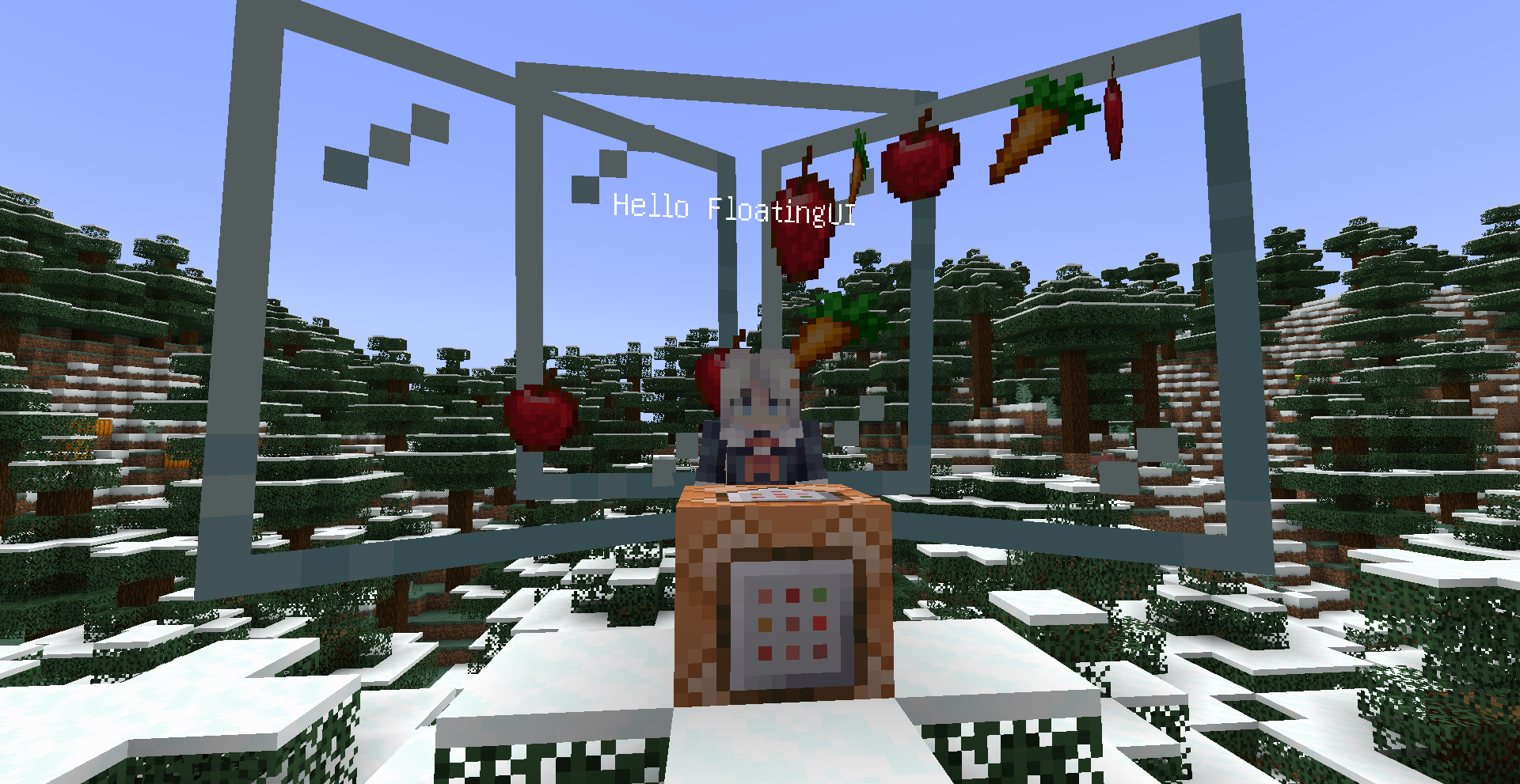


display entity is a feature officially introduced in 1.19.4. It can be used to display blockitem text and so on. In a sense, its potential as a UI development is basically comparable to that of container GUI, and it can even surpass container UI in terms of flexibility. In fact, there are many data packs or maps that implement UIs made with display entities. However, surprisingly, until now, there is no display entityUI library that supports dynamic parsing. Thus, Floating UI was born~
This UI library was originally part of a larger project, and its name Floating also comes from this project. But, in the end, I decoupled it and made it an independent project, called Floating UI.
Floating UI allows developers to define and render UI using SNBT format, and provides an event system for reading input operations such as user clicks. At the same time, it also supports developers to define custom user controls and automatic layout, simplifying UI drawing.
Pre-library prompt
Floating UI uses Xiaodou’s math library and Xiaodou’s event queue, use Xiaodou's math library to perform precise floating point calculations and intersection calculations, and use Xiaodou's event queue to host the timing triggering effect of events.
Basic usage
Tips
Please call manually before using Floating UIfunction floating_ui:loadInitialize the floating UI library!
If you want to create a UI, the easiest way is to usefloating_ui:.player_new_uifunction. This function will read the pre-entered layout data and generate a player-oriented UI interface in front of the executor.
# 写入UI布局数据
data modify floating_ui:input data set value {\
    "type":"panel",\
    "size":[5f,5f],\
    "child":[\
        {\
            "type":"button",\
            "y":0.3,\
            "size":[2.5f,2.5f],\
            "item":{"id":"apple"}\
        }\
    ]\
}

# 显示UI
function floating_ui:.player_new_ui
Tip
If you are running with the function in the data pack, you can use\Write layout data in new lines to improve the readability of layout data.
After calling this function,_scoreboardreturnThe unique numeric UID of the root entity of this UI will be stored in the score item, which can be saved for subsequent operations after the call. But——, this value will be overwritten every time it is called, so be sure to save it in time.
If you want to close a UI, there are two methods. The first is to call directlyfunction floating_ui:.player_dispose_uifunction, which will close all UI owned by the executor player.
Or, if you want to clear a certain UI, the previously saved UID will be useful. Suppose you want to clear the UI with UID 0, you can do this:
execute as @e[tag=floating_ui_root] \
    if score @s floating_ui.uid matches 0 \
run function floating_ui:_dispose_uifloating_ui:.player_new_uiThe created UI can only be interacted with by the player that created it (the player that performs this function). If you want to create a UI that all players can interact with, you can usefloating_ui:.world_new_ui. But be careful, the UI created in this way can only be deleted by selecting it by UID, so be sure to save its UID.
Data structure
Control
Floating UIlayout data is composed of UI control data.
The most basic class of all controls isbasecontrol, which contains the basic properties of all controls. This class is an abstract class and cannot be instantiated.

basecontrol:The base class for all controls
type:The type of control
x:xcoordinate. The origin is the centery:ycoordinate. The origin is the centerz:zcoordinate. The origin is the rotation of the central
rotation: control. is a quaternion. Default is[0f,1f,0f,0f]tag:tag of the controlanims:(list element)
Animation common tag
- <node type="homolist" name="value" />The target key-value pair of animation
  - <node type="compound" name="(list element)" :colon="false" />
Common tag
    - <node type="string" name="key" />The NBT key of the UI control entity to be modified by the animation
    - <node type="any" name="value" />The NBT target value to be modified by the animation
- <node type="float" name="time" />Animation duration
- <node type="string" name="start" />Event. Fired when animation starts.
- <node type="string" name="end" />event. Fires when the animation ends.
name:The unique string name of the control, used to save UUID - move_in:The namespaceid of a function or function tag. When the mouse standard star enters this control, it executes - move_out:the namespaceid of a function or function tag. When the mouse star leaves this control, it executes controlIt is the parent class of most controls and contains basic properties. This class is an abstract class and cannot be instantiated. existcontrolIn all subsequent data formats, the data related to UIcoordinate defaults to a block length.
control:The base class of all non-text component UI controlstag common to basic controls
type:Type of controlx:xcoordinate. The origin is the centery:ycoordinate. The origin is the centerz:zcoordinate. The origin is the rotation of the centralrotation: control. is a quaternion. Default is[0f,1f,0f,0f]tag:tag of the controlanims:(list element)
Animation common tags
- <node type="homolist" name="value" />The target key-value pair of animation
  - <node type="compound" name="(list element)" :colon="false" />
Common tag
    - <node type="string" name="key" />The NBT key of the UI control entity to be modified by the animation
    - <node type="any" name="value" />The NBT target value to be modified by the animation
- <node type="float" name="time" />Animation duration
- <node type="string" name="start" />Event. Fired when animation starts.
- <node type="string" name="end" />event. Fires when the animation ends.
name:The unique string name of the control, used to save UUID - move_in:The namespaceid of a function or function tag. When the mouse standard star enters this control, it executes - move_out:the namespaceid of a function or function tag. When the mouse standard star leaves this control, it executes display:corresponding to the item display entityitem_displayitem:item displays the item to be displayed by the entity
Item common tag
- <node type="string" name="id" />Item's id. If namespace is`minecraft`Can be omitted. If this item is omitted, the default is`glass_pane`
- <node type="byte" name="count" />item's id. If omitted, it defaults to`1b`. Basically useless,
- <node type="compound" name="tex" />(deprecated) item's CustomModelData
- <node type="compound" name="data" /> is a compound tag, corresponding to the vanilla item format`components.minecraft:custom_data`
- <node type="compound" name="components" />An item component
After creating the control, the additional data that can be accessed are:
control:The base class of all non-text component UI controlsx:A UUID array list of all possible child controls of this control.
textcontrolIt is the parent class of text control and contains some basic properties. Since it is difficult for the text display entity to store customized information, the textcontrol is divided into two entities: the marker and the text display entity. The marker is used to store information and is also a component of the UI interface node. The corresponding text display entity can be accessed through the marker.
textcontrol:The base class of all non-text component UI controlsAfter creating the text control, the additional data that can be accessed are:
textcontrol:The base class of all text component UI controls
parent:The UUID of the parent control of this controldisplayEntity:The text corresponding to this control displays the entity's UUID
. These two base class controls are abstract, that is, they cannot be created and displayed directly. The following control types can all be instantiated.
panelIs a simple container control in which other subspaces can be placed.
panel:tag common to controls
tag common to basic controls
type:Type of controlx:xcoordinate. The origin is the centery:ycoordinate. The origin is the centerz:zcoordinate. The origin is the rotation of the centralrotation: control. is a quaternion. The default is [0f,1f,0f,0f]tag:The tag of the controlanims:The animation effect of the control(list element)
Common tag for animations
- <node type="homolist" name="value" />The target key-value pair of animation
  - <node type="compound" name="(list element)" :colon="false" />
    - <node type="string" name="key" />The NBT key of the UI control entity to be modified by the animation
    - <node type="any" name="value" />The NBT target value to be modified by the animation
- <node type="float" name="time" />Animation duration
- <node type="string" name="start" />Event. Fired when animation starts.
- <node type="string" name="end" />event. Fires when the animation ends.
name:The unique string name of the control, used to save UUIDmove_in:The namespaceid of a function or function tag. When the mouse standard star enters this control, it executesmove_out:the namespaceid of a function or function tag. When the mouse standard star leaves this control, it executesdisplay:corresponding to the item display entityitem_displayitem:item displays the item to be displayed by the entity
item common tag
id:item's id. If namespace isminecraftCan be omitted. If this item is omitted, the default isglass_pane
count:item's id. If omitted, it defaults to1b. Basically useless,tex: (deprecated) item's CustomModelDatadata: is a compound tag, corresponding to the vanilla item formatcomponents.minecraft:custom_datacomponents:An item componentchild:Child control(list element)
Common tags for basic controls
- <node type="string" name="type" />The type of control
- <node type="double" name="x" />xcoordinate. The origin is the center
- <node type="double" name="y" />ycoordinate. The origin is the center
- <node type="double" name="z" />zcoordinate. The origin is the rotation of the central
- <node type="homolist" name="rotation" /> control. is a quaternion. The default is [0f,1f,0f,0f]
- <node type="homolist" name="tag" />The tag of the control
- <node type="homolist" name="anims" />The animation effect of the control
  - <node type="compound" name="(list element)" :colon="false" />
Common tag for animations
    - <node type="homolist" name="value" />The target key-value pair of animation
      - <node type="compound" name="(list element)" :colon="false" />
        - <node type="string" name="key" />The NBT key of the UI control entity to be modified by the animation
        - <node type="any" name="value" />The NBT target value to be modified by the animation
    - <node type="float" name="time" />Animation duration
    - <node type="string" name="start" />Event. Fired when animation starts.
    - <node type="string" name="end" />event. Fires when the animation ends.

- <node type="string" name="name" />The unique string name of the control, used to save UUID
- <node type="string" name="move_in" />The namespaceid of a function or function tag. When the mouse standard star enters this control, it executes
- <node type="string" name="move_out" />the namespaceid of a function or function tag. When the mouse star leaves this control, it executes
buttonIt is a basic button control that can be clicked and trigger click events.
button:tag common to controls
tag common to basic controls
type:Type of controlx:xcoordinate. The origin is the centery:ycoordinate. The origin is the centerz:zcoordinate. The origin is the rotation of the centralrotation: control. is a quaternion. The default is [0f,1f,0f,0f]tag:The tag of the controlanims:The animation effect of the control(list element)
Common tag for animations
- <node type="homolist" name="value" />The target key-value pair of animation
  - <node type="compound" name="(list element)" :colon="false" />
    - <node type="string" name="key" />The NBT key of the UI control entity to be modified by the animation
    - <node type="any" name="value" />The NBT target value to be modified by the animation
- <node type="float" name="time" />Animation duration
- <node type="string" name="start" />Event. Fired when animation starts.
- <node type="string" name="end" />event. Fires when the animation ends.
name:The unique string name of the control, used to save UUIDmove_in:The namespaceid of a function or function tag. When the mouse standard star enters this control, it executesmove_out:the namespaceid of a function or function tag. When the mouse standard star leaves this control, it executesdisplay:corresponding to the item display entityitem_displayitem:item displays the item to be displayed by the entity
item common tag
id:item's id. If namespace isminecraftCan be omitted. If this item is omitted, the default isglass_panecount:item's id. If omitted, it defaults to1b. Basically useless,tex: (deprecated) item's CustomModelDatadata: is a compound tag, corresponding to the vanilla item formatcomponents.minecraft:custom_datacomponents:An item componentleft_click:Event. Theright_click: event is triggered when this button is clicked with the left mouse button. Triggered when this button is clicked with the right mouse buttoncontent:The content of the button is a control. Ignored if specifieditem, and displays the button as the specified control.
Common tag for basic controls
type:The type of controlx:xcoordinate. The origin is the centery:ycoordinate. The origin is the centerz:zcoordinate. The origin is the rotation of the centralrotation: control. is a quaternion. The default is [0f,1f,0f,0f]tag:The tag of the controlanims:The animation effect of the control(list element)
Common tag for animations
  - <node type="homolist" name="value" />The target key-value pair of animation
    - <node type="compound" name="(list element)" :colon="false" />
      - <node type="string" name="key" />The NBT key of the UI control entity to be modified by the animation
      - <node type="any" name="value" />The NBT target value to be modified by the animation
  - <node type="float" name="time" />Animation duration
  - <node type="string" name="start" />Event. Fired when animation starts.
  - <node type="string" name="end" />event. Fires when the animation ends.
name:The unique string name of the control, used to save UUIDmove_in:The namespaceid of a function or function tag. When the mouse standard star enters this control, it executesmove_out:the namespaceid of a function or function tag. When the mouse star leaves this control, it executes
textblockIt is a basic text control that can display specified text
textblock:Tag common to text controls
Tag common to basic controls
type:Type of controlx:xcoordinate. The origin is the centery:ycoordinate. The origin is the centerz:zcoordinate. The origin is the rotation of the centralrotation: control. is a quaternion. The default is [0f,1f,0f,0f]tag:The tag of the controlanims:The animation effect of the control(list element)
Common tag for animations
- <node type="homolist" name="value" />The target key-value pair of animation
  - <node type="compound" name="(list element)" :colon="false" />
    - <node type="string" name="key" />The NBT key of the UI control entity to be modified by the animation
    - <node type="any" name="value" />The NBT target value to be modified by the animation
- <node type="float" name="time" />Animation duration
- <node type="string" name="start" />Event. Fired when animation starts.
- <node type="string" name="end" />event. Fires when the animation ends.
name:The unique string name of the control, used to save UUIDmove_in:The namespaceid of a function or function tag. When the mouse standard star enters this control, it executesmove_out:the namespaceid of a function or function tag. The mouse standard star executes when leaving this control
fontsize:The size of the font. For input onlytext:The string to be displayed. If it is a list, it represents multi-line textalign:Text alignment, there areleft,right,centerThree types. Default isleft
listIt is a container control that can display a scrolling series of controls. The controls can be scrolled using the mouse wheel.
list:tag common to controls
tag common to basic controls
type:Type of controlx:xcoordinate. The origin is the centery:ycoordinate. The origin is the centerz:zcoordinate. The origin is the rotation of the centralrotation: control. is a quaternion. The default is [0f,1f,0f,0f]tag:The tag of the controlanims:The animation effect of the control(list element)
Common tag for animations
- <node type="homolist" name="value" />The target key-value pair of animation
  - <node type="compound" name="(list element)" :colon="false" />
    - <node type="string" name="key" />The NBT key of the UI control entity to be modified by the animation
    - <node type="any" name="value" />The NBT target value to be modified by the animation
- <node type="float" name="time" />Animation duration
- <node type="string" name="start" />Event. Fired when animation starts.
- <node type="string" name="end" />event. Fires when the animation ends.
name:The unique string name of the control, used to save UUIDmove_in:The namespaceid of a function or function tag. When the mouse standard star enters this control, it executesmove_out:the namespaceid of a function or function tag. When the mouse standard star leaves this control, it executesdisplay:corresponding to the item display entityitem_displayitem:item displays the item to be displayed by the entity
item common tag
id:item's id. If namespace isminecraftCan be omitted. If this item is omitted, the default isglass_panecount:item's id. If omitted, it defaults to1b. Basically useless,tex: (deprecated) item's CustomModelDatadata: is a compound tag, corresponding to the vanilla item formatcomponents.minecraft:custom_datacomponents:An item componentchild:Child control(list element)
Common tags for basic controls
- <node type="string" name="type" />Control type
- <node type="double" name="x" />xcoordinate. The origin is the center
- <node type="double" name="y" />ycoordinate. The origin is the center
- <node type="double" name="z" />zcoordinate. The origin is the rotation of the central
- <node type="homolist" name="rotation" /> control. is a quaternion. The default is [0f,1f,0f,0f]
- <node type="homolist" name="tag" />The tag of the control
- <node type="homolist" name="anims" />The animation effect of the control
  - <node type="compound" name="(list element)" :colon="false" />
Common tag for animations
    - <node type="homolist" name="value" />The target key-value pair of animation
      - <node type="compound" name="(list element)" :colon="false" />
        - <node type="string" name="key" />The NBT key of the UI control entity to be modified by the animation
        - <node type="any" name="value" />The NBT target value to be modified by the animation
    - <node type="float" name="time" />Animation duration
    - <node type="string" name="start" />Event. Fired when animation starts.
    - <node type="string" name="end" />event. Fires when the animation ends.

- <node type="string" name="name" />The unique string name of the control, used to save UUID
- <node type="string" name="move_in" />The namespaceid of a function or function tag. When the mouse standard star enters this control, it executes
- <node type="string" name="move_out" />the namespaceid of a function or function tag. When the mouse star leaves this control, it executes
spriteandcontrolThere is almost no new control data that can be used to display an item, which can be used to display some pictures by modifying the texture.
stackpanelIt is an auto-layout container that can automatically arrange internal controls in a specified layout.
stackpanel:tag common to controls
tag common to basic controls
type:Type of controlx:xcoordinate. The origin is the centery:ycoordinate. The origin is the centerz:zcoordinate. The origin is the rotation of the centralrotation: control. is a quaternion. The default is [0f,1f,0f,0f]tag:The tag of the controlanims:The animation effect of the control(list element)
Common tag for animations
- <node type="homolist" name="value" />The target key-value pair of animation
  - <node type="compound" name="(list element)" :colon="false" />
    - <node type="string" name="key" />The NBT key of the UI control entity to be modified by the animation
    - <node type="any" name="value" />The NBT target value to be modified by the animation
- <node type="float" name="time" />Animation duration
- <node type="string" name="start" />Event. Fired when animation starts.
- <node type="string" name="end" />event. Fires when the animation ends.
name:The unique string name of the control, used to save UUIDmove_in:The namespaceid of a function or function tag. When the mouse standard star enters this control, it executesmove_out:the namespaceid of a function or function tag. When the mouse standard star leaves this control, it executesdisplay:corresponding to the item display entityitem_displayitem:item displays the item to be displayed by the entity
item common tag
id:item's id. If namespace isminecraftCan be omitted. If this item is omitted, the default isglass_panecount:item's id. If omitted, it defaults to1b. Basically useless,tex: (deprecated) item's CustomModelDatadata: is a compound tag, corresponding to the vanilla item formatcomponents.minecraft:custom_datacomponents:An item componentalign:The layout method of the control. There are three values of right, left and centerchild:Child control(list element)
tag common to basic controls
- <node type="string" name="type" />Type of control
- <node type="double" name="x" />xcoordinate. The origin is the center
- <node type="double" name="y" />ycoordinate. The origin is the center
- <node type="double" name="z" />zcoordinate. The origin is the rotation of the central
- <node type="homolist" name="rotation" /> control. is a quaternion. The default is [0f,1f,0f,0f]
- <node type="homolist" name="tag" />The tag of the control
- <node type="homolist" name="anims" />The animation effect of the control
  - <node type="compound" name="(list element)" :colon="false" />
Common tag for animations
    - <node type="homolist" name="value" />The target key-value pair of animation
      - <node type="compound" name="(list element)" :colon="false" />
        - <node type="string" name="key" />The NBT key of the UI control entity to be modified by the animation
        - <node type="any" name="value" />The NBT target value to be modified by the animation
    - <node type="float" name="time" />Animation duration
    - <node type="string" name="start" />Event. Fired when animation starts.
    - <node type="string" name="end" />event. Fires when the animation ends.

- <node type="string" name="name" />The unique string name of the control, used to save UUID
- <node type="string" name="move_in" />The namespaceid of a function or function tag. When the mouse standard star enters this control, it executes
- <node type="string" name="move_out" />a funThe namespaceid of the ction or function tag. The mouse standard star executes when leaving this control

gap:(TODO) The gap between child controls
event
Floating The event mechanism of the UI is quite simple. Wherever the event is marked in the data format, you can write the namespaceID or function tag of a function, so that the specified function can be executed when needed.
For example, we can add a click event to a button like this:
{
    "type":"button",
    "left_click":"example:event/click"
}
will be executed when we click the buttonexample:event/clickThe content in the function.
In function, the executor of function is the control where the event is located, not the player. If you want to access the player, you can usefloating_ui_ownertag.
Animation
Since it is a UI library, of course animation support is indispensable! Floating UI provides some basic animation functions with the interpolation function of Minecraft display entity. Animations are usually executed when an event is triggered. The data format of the animation is as follows:
animation:value:The target key-value pair of the animation(list element)key:The NBT key of the UI control entity to be modified by the animation
value:The NBT target value to be modified by the animation
time:Animation durationstart:Event. Fired when animation starts.end:event. Fires when the animation ends.
For example, to have apanelTo increase the size when the mouse enters, you can write:
{
    "type":"panel",
    "anim":{
        "move_in":{
            "value":[
                {
                    "key":"transformation.scale[]",
                    "value":3f
                }
            ],
            "time":3,
            "start":"example:event/anim/start",
            "end":"example:event/anim/end"
        }
    }
}
However, unlike other events, the two events in the animationstartandendIt cannot be used to trigger animations.
Control Template
Generally speaking, a useful UI library must not lack custom controls, user controls, or templates, and Floating UI is certainly no exception. Through control templates, multiple controls can be packaged together, so that you don't have to write the same code repeatedly. The definition and use of control templates in Floating UI are very simple.
template:content:Template packaged controls
tag common to basic controls
type:Type of controlx:xcoordinate. The origin is the centery:ycoordinate. The origin is the centerz:zcoordinate. The origin is the rotation of the centralrotation: control. is a quaternion. The default is [0f,1f,0f,0f]tag:The tag of the controlanims:The animation effect of the control(list element)
Common tag for animations
  - <node type="homolist" name="value" />The target key-value pair of animation
    - <node type="compound" name="(list element)" :colon="false" />
      - <node type="string" name="key" />The NBT key of the UI control entity to be modified by the animation
      - <node type="any" name="value" />The NBT target value to be modified by the animation
  - <node type="float" name="time" />Animation duration
  - <node type="string" name="start" />Event. Fired when animation starts.
  - <node type="string" name="end" />event. Fires when the animation ends.
name:The unique string name of the control, used to save UUIDmove_in:The namespaceid of a function or function tag. When the mouse standard star enters this control, it executesmove_out:The namespaceid of a function or function tag. When the mouse standard star leaves this control, it is executedparams:A series of key-value pairs define the parameters in the template. The key name represents the parameter name, and the key value represents the NBT relative path starting from the content
Pass this NBT data infloating_ui:data custom.<模板名>to register this template, and then you can directlytypeThe template name is used in the field and parameters are passed in.
Here is an example:
data modify storage floating_ui:data custom.test set value {\
    "content": {\
        "type": "panel",\
        "name": "test",\
        "size": [5f, 5f],\
        "child": [\
            {\
                "type": "textblock",\
                "text": "default"\
            }\
        ]\
    },\
    "params": {\
        "text": "child[0].text"\
    }\
}

data modify storage floating_ui:input data set value {\
    "type": "test",\
    "params":[\
        {"key":"text", "value":"Hello FloatingUI"}\
    ],\
}
Floating UI API)
Control access
There are two ways to access controls, one is to use one-to-one name list access, and the other is to use tags to access multiple controls.
name
To use the name list to access a control, you need to add the corresponding name attribute to the layout data.
{
    "type":"panel",
    "size":[5f,5f],
    "child":[
        {
            "name":"apple_button",
            "type":"button",
            "y":-1,
            "size":[1.2f,1.2f],
            "item":{
                "id":"apple"
            }
        }
    ]
}
After
, you can access it when selecting the root entity.data.names.<name>This nbt is used to obtain the uuid of the corresponding control. Well, if there are multiple controls with the samenameWhat to do? Naturally, the later ones will overwrite the previous ones, and only the last control will be accessed.
tag
Of course, it can also be settagProperty, add a tag to the control to achieve access to multiple controls.
{
    "type":"panel",
    "size":[5f,5f],
    "child":[
        {
            "tag":"fruit_button",
            "type":"button",
            "y":-1,
            "size":[1.2f,1.2f],
            "item":{
                "id":"apple"
            }
        },
        {
            "tag":"fruit_button",
            "type":"button",
            "y":1,
            "size":[1.2f,1.2f],
            "item":{
                "id":"carrot"
            }
        }
    ]
}
After
, we can use the tag option of the target selector to select the control we need.
execute as @e[tag=fruit_button] run ...Floating function
Floating UI provides some functions that are easy to call. Ignore all the following functionsfloating_uinamespace. APIs marked Non-Public are subject to breaking changes.
.player_new_ui
generates a new UI belonging to the command executor according to the layout data in floating_ui:input data.
is called directly.
.player_dispose_ui
Destroy all UI owned by this player
Directly call
_new_ui(Non-public)
generates the UI belonging to [tag=floating_ui_owner]player according to the layout data in floating_ui:input data.
requiredexecute summon item_display run function thisMake the call
_dispose_ui
deletes this UI as the function executor.
requiredexecute as UI实体 run function thisMake the call
.player_tree
outputs the structure of this player's UI.
is called directly.
util/_tree(Non-public)
outputs the structure of the UI as the function executor in the chat bar.
requiredexecute as UI实体 run function thisCall
using XMLfeature under development
Do you think writing NBT is too troublesome? It doesn't matter, mcdoc is built into Floating UI's data pack, which can realize automatic completion. But line breaks in command are still troublesome. What to do, maybe you can also use json. Floating UI's data pack also contains a series of json schemas. Just write the json, copy it, and then hold down the middle mouse button to add line breaks at the end in batches.\La.
Still find it troublesome, it doesn’t matter, we still have the ultimate weapon-XML.
Let’s go directly to the example:
Details
<?xml version="1.0" encoding="UTF-8" ?>
<?xml version="1.0" encoding="UTF-8" ?>
<UI xmlns:xsi="http://www.w3.org/2001/XMLSchema-instance" xsi:noNamespaceSchemaLocation="schema.xml">
    <Window>
        <Panel width="6" height="6">
            <Panel.Item tex="11451000"/>
            <Panel width="5" height="2.1" y="-2">
                <Panel.Item tex="11451000"/>
                <Panel.Anim>
                    <Animation trigger="new"/>
                </Panel.Anim>
                <Sprite name="bg1" x="-2.5" width="0" height="2.1">
                    <Sprite.Item tex="11451002" id="yellow_stained_glass_pane"/>
                    <Sprite.Anim>
                        <Animation trigger="new" time="3" end="floating:ui/1/anim/new_next">
                            <Property key="transformation.translation[0]" value="0"/>
                            <Property key="transformation.translation[1]" value="5"/>
                        </Animation>
                    </Sprite.Anim>
                </Sprite>
                <Sprite name="bg2" x="-2.5" width="0" height="2.1">
                    <Sprite.Anim>
                        <Animation trigger="new" time="3" delay="3">
                            <Property key="transformation.translation[0]" value="-0.1"/>
                            <Property key="transformation.translation[1]" value="4.8"/>
                        </Animation>
                    </Sprite.Anim>
                </Sprite>
                <TextButton y="0.7" x="1">选择1</TextButton>
                <TextButton x="1">选择2</TextButton>
                <TextButton y="-0.7" x="1">选择2</TextButton>
            </Panel>
            <Sprite name="character" x="-4" z="0.002">
                <Sprite.Item id="paper" tex="11450001"/>
                <Sprite.Anim>
                    <Animation trigger="new" time="3">
                        <Property key="transformation.translation[0]" value="-3"/>
                    </Animation>
                </Sprite.Anim>
            </Sprite>
            <TextBlock name="character_name" fontsize="3" align="center" y="-1" x="-1.5" z="0.002">霜叶</TextBlock>
        </Panel>
    </Window>

    <Template id="TextButton" params="value">
        <Button width="3" height="0.7">
            <Button.Anim>
                <Animation trigger="new"/>
            </Button.Anim>
            <TextBlock fontsize="1" align="center">{value}</TextBlock>
        </Button>
    </Template>
</UI>
In Floating UI XML, the root node isUIand aWindow,existWindowWriting Floating UI in . Apart fromWindowsEverything else inside can be copied directly. andUIThere is another one belowTemplateNodes are used to define templates.
Converting from NBT to XML is very simple. For simple attribute values (such as strings, numbers, etc.), just remember this form:<控件类型 属性=值></控件类型>, and for attribute values of type composite tag, for exampleitem, write in the control tag<控件类型.属性ID 键=值></控件类型>. In the above example, basically all the formats have been explained clearly, you can compare them yourself.
TIP
For templates in XML format, there is a special syntactic sugar, which is namedvalueproperties. It corresponds to the value written directly in the slot when using the template.
For example, in the above example there is the template:
<Template id="TextButton" params="value">
    <Button width="3" height="0.7">
        <Button.Anim>
            <Animation trigger="new"/>
        </Button.Anim>
        <TextBlock fontsize="1" align="center">{value}</TextBlock>
    </Button>
</Template>
where the params are definedvalueattribute, in the template atTextBlocktext position, so it will replaceTextBlocktext in . When used:
<TextButton y="0.7" x="1">选择1</TextButton>text at this time选择1will default tovalueThe value is passed into the template without writingvalue="选择1"